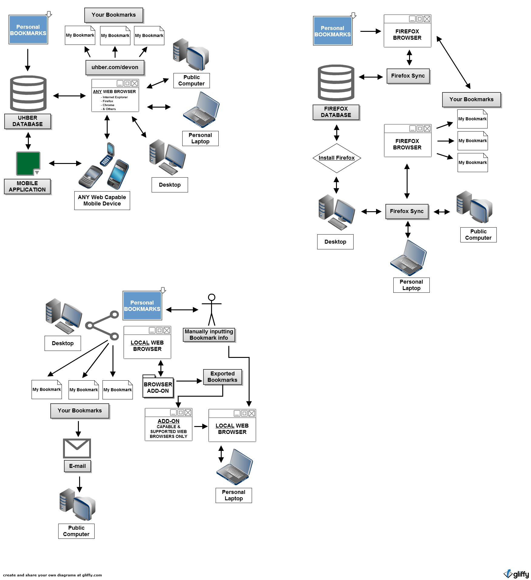
Your first tab and the last
homepage you’ll ever need.
2011 – 2013
What is Uhber?
Before UberCab had the mindshare (and the domain), Uhber stood for “ultimate homepage” (hence the UH in uhber).
Mission
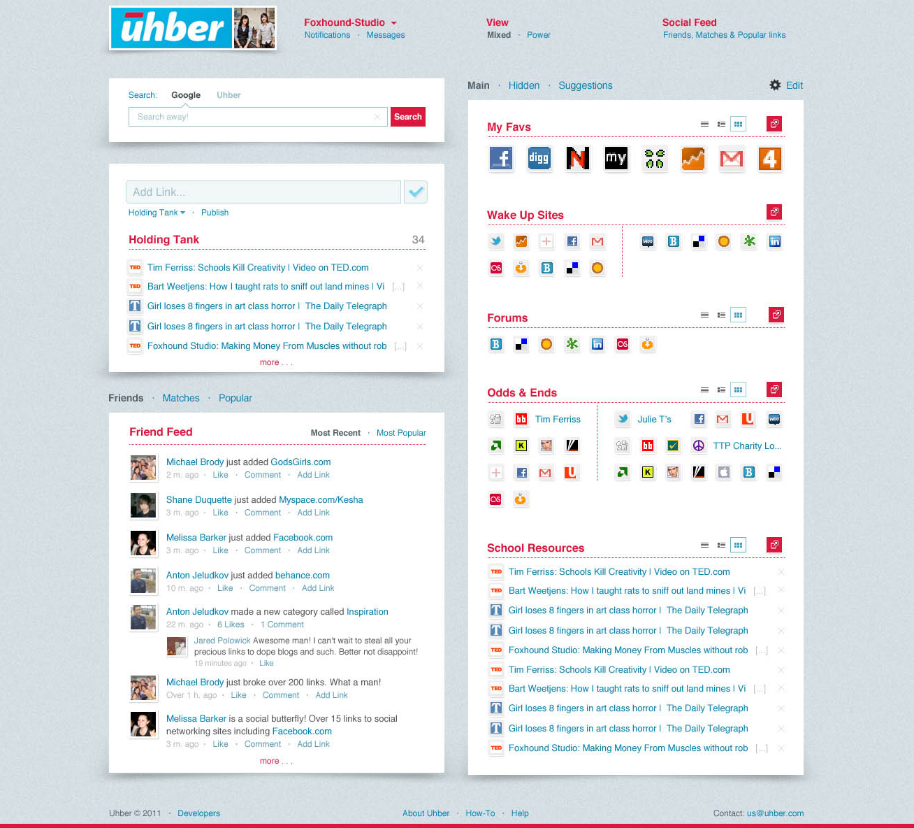
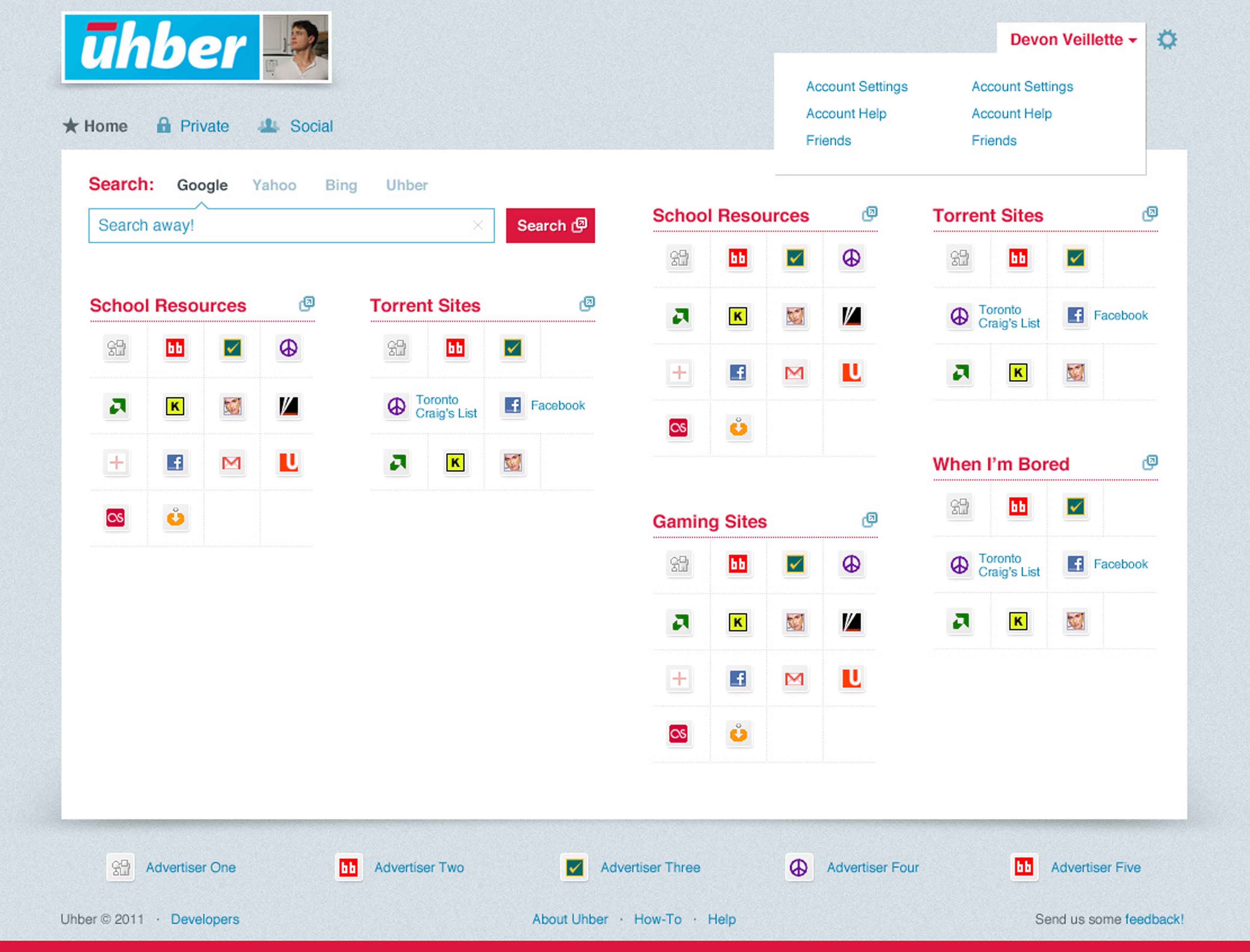
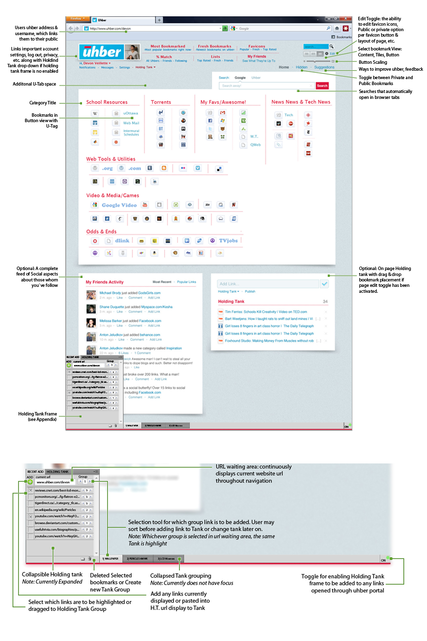
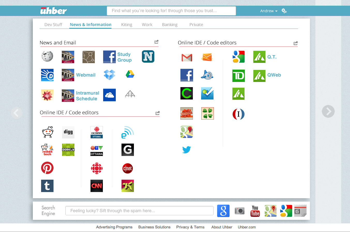
From this single URL, an interface displaying visually grouped favicons, which represent a user’s most preferred sites, would have allowed the user to springboard to each website in new tabs, making their everyday routine easy while offering a new and innovative way of searching through the Internet.
Team & Roll
I worked with two fantastically talented individuals. Together we were a formidable tripod of singular vision. Katarina and I wore many hats, we shared project management among others but her word was law in terms of organization.

Katarina Dunham
Business & Admin

Andrew Forward
Software

Devon Veillette
Design & Business
Preliminary Research
I’ve read and written so much on browsing behaviour that I feel as though I could write a dissertation. Parallel Browsing Behaviour & Modeling (tab browsing), Horizontal & Vertical Search (search engine use), and how all of these are influenced by mobile & social networks just to name a “PEW” (bad Pew Research Center dad joke).
Statistical Meta & Potatoes
In plain english, my research focused on how people browsed the web, how tab browsing was more prevalent to certain younger demographics, how the majority of search engine traffic is refinding the same information over and over (figure below), and how search behaviour is shifting away from traditional search engines.
For example within Amazon (vertical search), as opposed to Googling a product followed by the term “amazon” (horizontal). There is so much more to mention but these are but a taste of data delved into.
These may not sound mind blowing but if you see how they intersect in the rhizome they paint an insightful picture of opportunity.
10 websites accounted for:
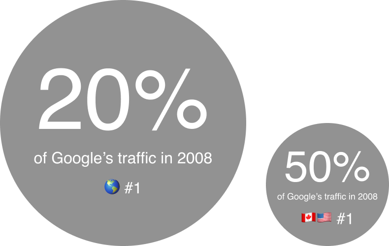
All rank statistics courtesy of Alexa. The web information company.
All use statistics courtest of Google and WorldWideWebSize.
Visual-Spatial Intelligence
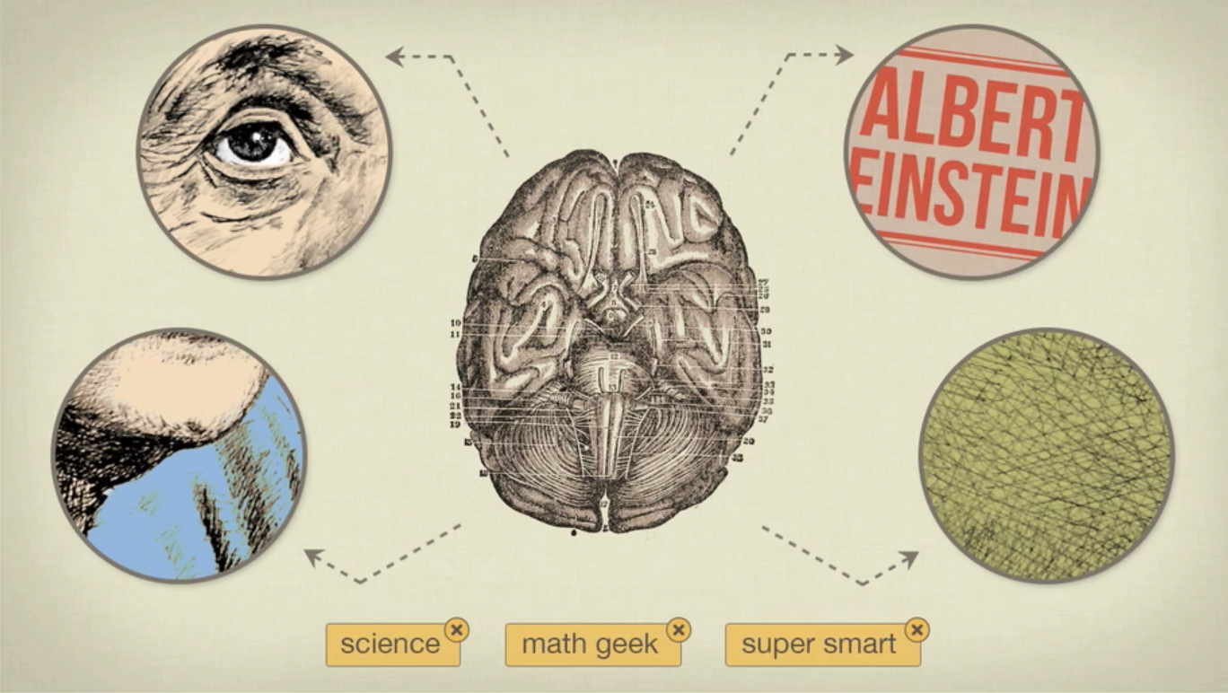
Take this photo of Albert Einstein for example, you’re more likely to remember this image rather than this sequence of numbers.
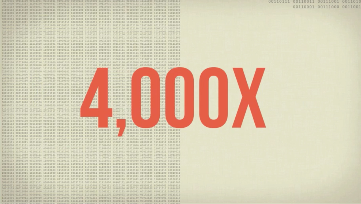
Even though the image contains 4000x times more information
Your brain is performing complex shape, text, and colour recognition tasks. Associating this image with sequence of letters and categories. All in a fraction of a second.
First Hand Study
I conducted my own modest research to further corroborate or disprove my initial theories about how people use the web and browse. I canvassed roughly 28 individuals who owned and used more than 1 computer, rejected the default browser of their chosen OS, and browsed the web exclusively using tabs, among other technically savvy characteristics.
The most interesting characteristic I found among these “power users” of the web that were not mentioned in any studies was the use of the browser's bookmark bar. All of these users used the bookmark bar below the web address field and due to the limited space would edit the bookmarks to have no names leaving only the favicon to act as a button in which these users would springboard into new tabs.
Many of those in the study even used firefox's built in dividers and would painstakingly organize these favicon “buttons” by categories of their own choosing. When asked how they knew what was what they said they had placed them there, only furthering my previous findings about our spatial intelligence and muscle memory in a digital space.
When labels were used the users only opted for single letter, symbol, or the order in appearance to differentiate duplicate favicons with two separate destination inside a given website (ie. digg.com’s homepages and digg.com’s images only would have two urls but the favicon for each bookmark button would look the same.)
Business Plan
It would have been ideal to tinker away within a vacuum to focus predominantly on design & product related research, but seldom is anything so binary.
The upside to this research was that it was done alongside Katie. Extensive time and research was put into competition, concerns, demand, financial plans, future plans, industry behaviour, marketing / promotion, and of course everyone's favourite - monetization. These are but the tops of an organization tree with deep subsets of modeling, excel pages, and documents.
(the Google Drive is still alive and kicking should anyone want to see to what extent of merit behind these claims. The same can be said of our Business Plan doc.)
Problem Framing
Every homepage is different
- We all visit the same sites over and over yet all our starting pages differ.
- Widgets, Search Engines, and bookmarks miss the mark when it comes to using the web.
- In a perfect world a homepage is ideally a page of pathways tailored to you and only you.
Search involves too much searching...
- Context is king but most of the time we’re searching for something someone else already knows or has expertise about.
- You can’t trust every link, everyone is an expert, and half the battle is knowing where to look.
- The internet isn’t made up of only people you trust but what if it were?
Why Search when we can leverage someone's expertise?
- In a perfect world there are no trolls, the Internet only produces gold fantastic results.
- A search engine which passively leverages the expertise of people' we trust (like the Borg.)
- In a perfect world a homepage is ideally a page of pathways tailored to you and only you.
Prototyping
Inspiration
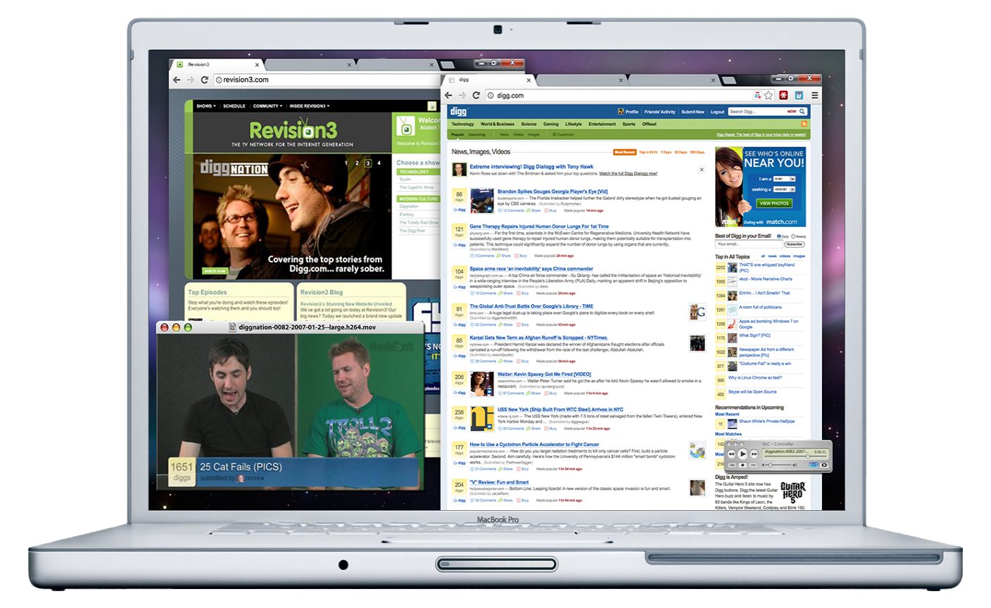
At the time I was heavily influenced by Web 2.0 design (before Facebook timeline), it was the height of digg.com, and the heyday of Diggnation on Revision3. I often kept a collection or complete save of webpages, screenshots, and detailed notes. Twitter Bootstrap (Ruby on Rails) was the biggest jump in web apps and most of the great design worked within the framework -- Uhber was to be no exception.
Revision3, Digg.com, Diggnation
Sketching
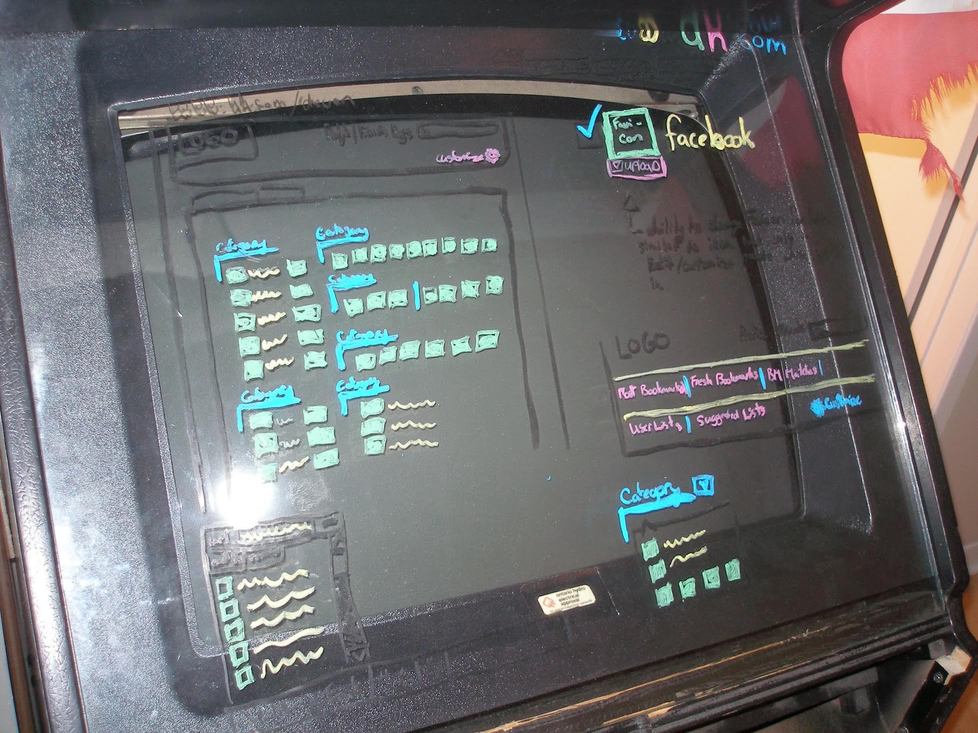
Initial sketching began crudely as a series of window marker drawings on an arcade cabinet, progressing into duct tape and bubblegum photoshop wireframes, and eventually blossomed into cohesive blueprints.
Visual Design
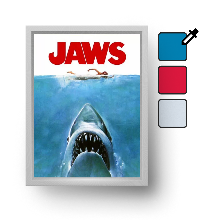
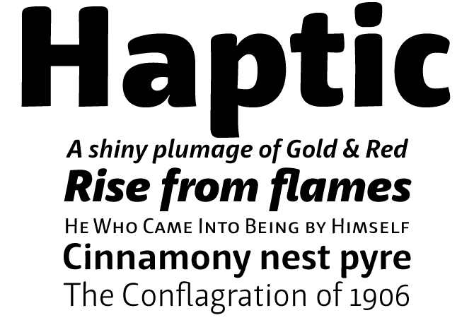
With the structure of the website solidified, I began by pulling a colour pallet from the JAWS poster (my favourite movie). I then proceeded to the logo, scouring for a look and feel to the font. I leaned on a few friends here and they suggested a font I still love - Haptic.
It was important to have the University Emblem and even colours present throughout the design, so a neutral non-distracting palette was needed. During the design process I would toggle between UPenn’s colours and Princeton University.
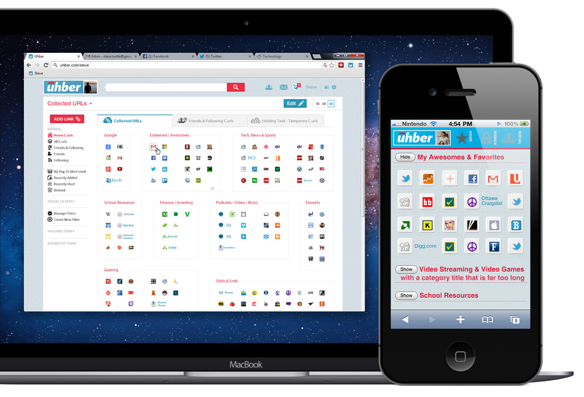
In an effort to distinguish Uhber from the rest of the web, and to embody a sense of adventure while remaining true to the JAWS origin, I thought of the page as a beach. All great adventures land on a beach and all colours look great set against an ocean. No ocean is an even single colour so I opted for a repeated noise background with everything floating atop.
Favicons were typically no larger than 16px by 16px at the time. I personally love grids and divided up everything accordingly. I tried to incorporate inspiration from my favourite websites of the time but the most important rule of Uhber’s design was “everything at a glance”. There must be no diving, only scanning of your virtual horizon, and an embodied desktop view for bookmarks instead of applications.
Learn
A/B Testing
During our Alpha we ran layout tests (including breaking our cardinal-rule of “everything at a glance”), experimented with larger than 16x16 pixel favicons, scraping logos instead of favicons, allowing users to upload images (even moving .gifs) to their buttons, and surprisingly some of our experiments look like the new tab pages of today, to name a few.
First Hand Study
True to the product’s core idea of “everything at a glance,” I had setup with Andrew a “God's eye” view of all the accounts, bookmarks, and favicon directory (nothing nefarious I assure).
With a little bit of javascript magic we were able to see how people were using the product, update any feedback issues quickly from one account, and watch as patterns emerged.
Launch
After the majority of the ultimate homepage was developed, we launched Uhber via word-of-mouth. We had a decent amount of traffic and the majority of our users were using uhber.com/theirname as their homepage, but we had an immense amount of brand confusion (as one could expect) with Uber cab, as well as difficulty conveying the value proposition concisely to our new users.
One on one demonstrations almost always converted a new user but our marketing was severely lagging. The product was great and people eventually loved it, but we stumbled a few too many times.
Looking Forward
Money talks and, like many startups, we couldn’t justify the cost. Looking back we moved along to our second phase of development too quickly, trying to implement Elasticsearch (open source search & analytics) for the search engine portion we were so excited about.
After being passed over by Y-Combinator we thought we could make up for the opportunity loss by chasing revenue, but our inexperience cost us everything. It was an amazing learning experience for all of us; it was immensely fun, stressful, and challenging. Even though we may have crashed and burned, that experience has taught me that I am tempered metal.
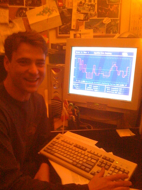
We didn’t take enough photos during our journey, so here I am performing data recovery.
© 2024 Devon Veillette, all rights reserved.
All content are exclusively for private usage and non-commercial purposes
Case Studies

