Reimagining Netflix
2017
Overview
Reimagining Netflix
2017
Summary
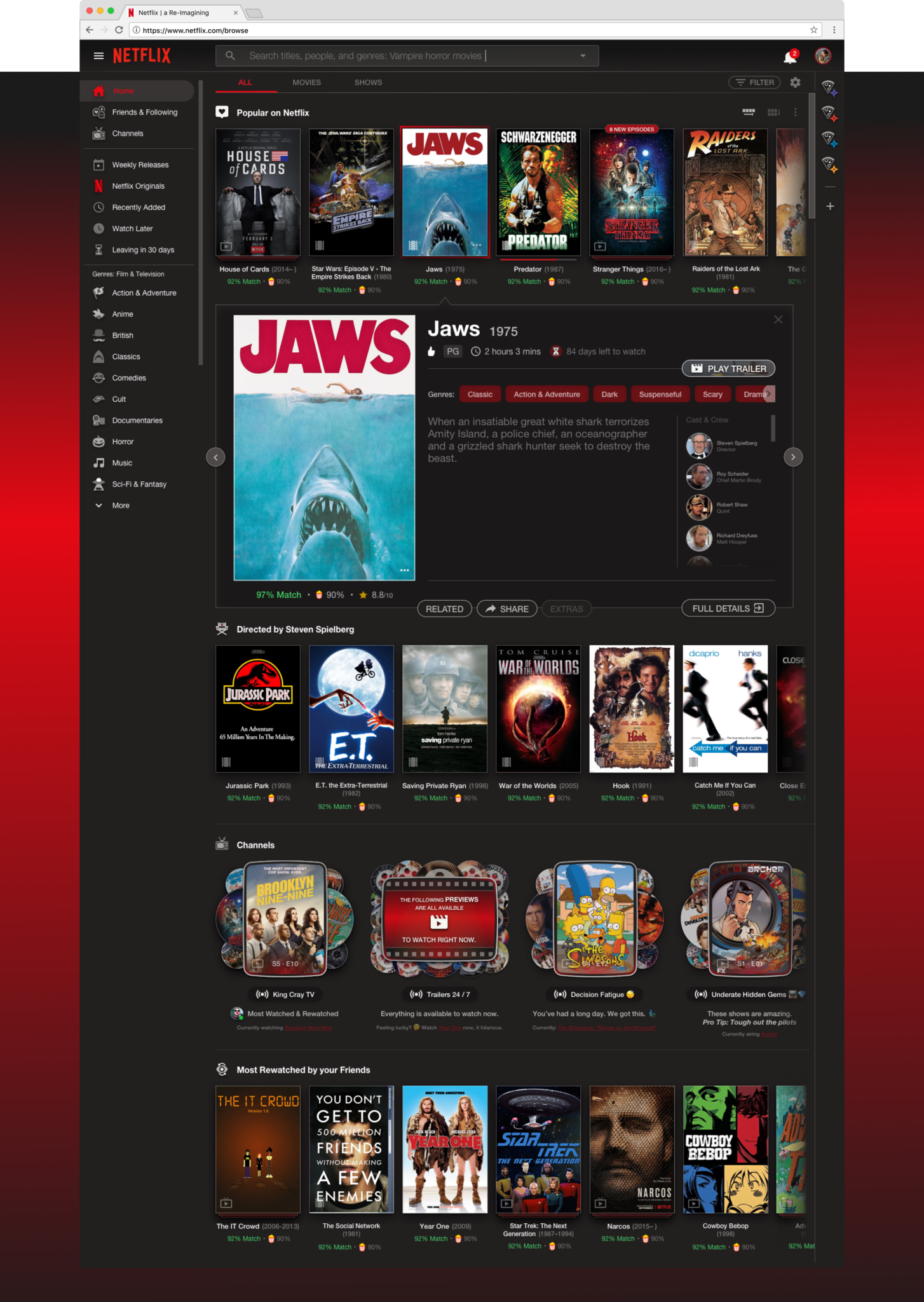
In 2017, I took on a self-initiated challenge to redesign Netflix, aiming to address limitations in content discovery, create richer user experiences, and incorporate nostalgic elements from classic video store and DVD-era design. Over 60 hours outside of work, I conceptualized new features and workflows, such as dynamic trailer channels, interactive film credits, personalized recommendations based on social connections, and an improved system for filtering and organizing content. This project not only showcased my design thinking but also demonstrated my dedication to user experience and storytelling.
Timeline
60 hours
Project Info
Design Task
Tools
Sketch, Photoshop
Challenge
While Netflix dominates the streaming industry, it faces several key limitations in its user experience:
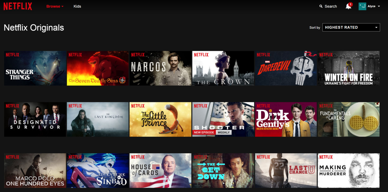
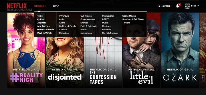
Disposable Visual Design
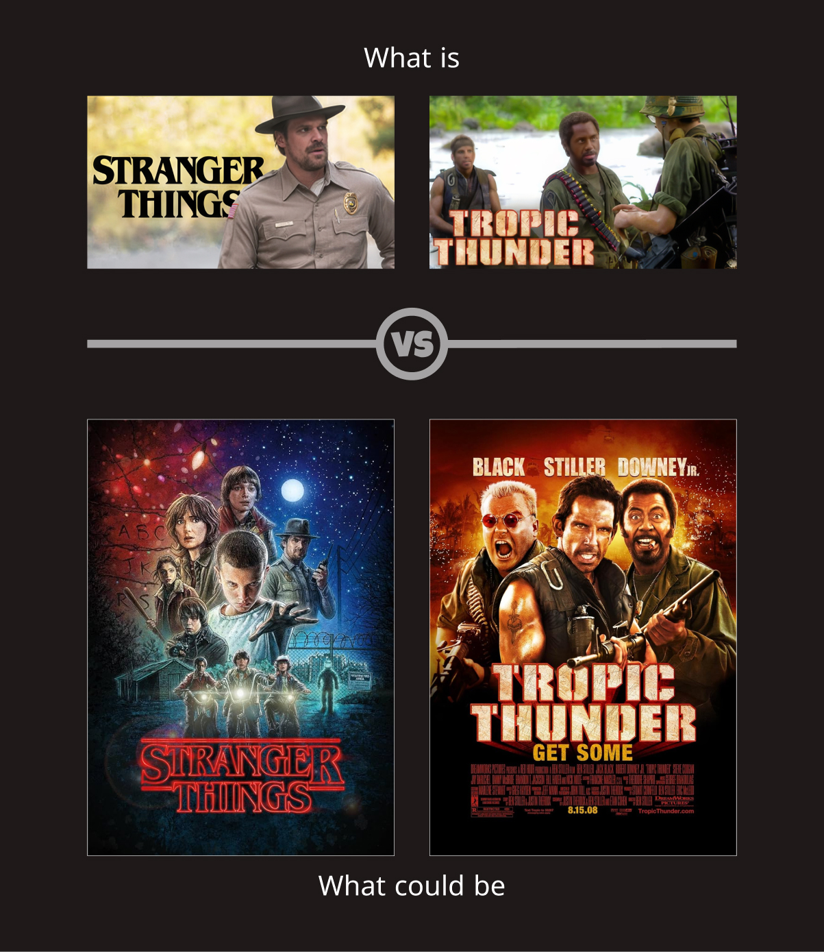
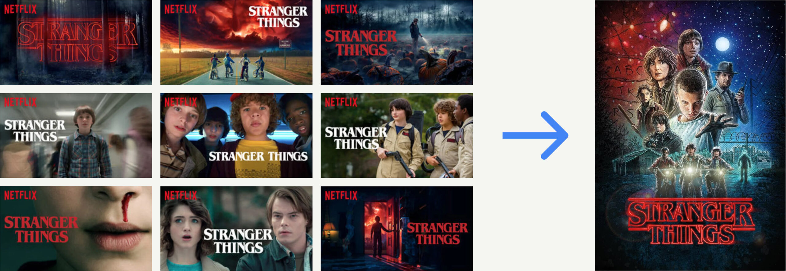
The reliance on horizontal thumbnails and static imagery lacked the prestige and emotional resonance of traditional movie posters and DVD covers.
Limited Filtering
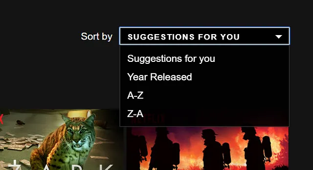
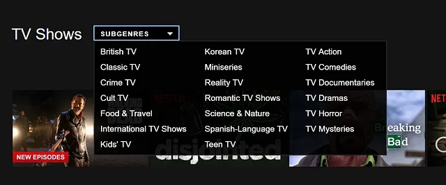
Users struggled to browse and filter content with the depth of a video store or curated library.
Loss of DVD Bonus Features
Iconic elements like trailers, making-of documentaries, and commentary tracks were absent, limiting the richness of the viewing experience.
Decision Fatigue
With endless scrolling and no passive discovery options, users often struggled to find something to watch.
Static Content Recommendations
Personalization lacked social context or deeper insights into users’ nuanced preferences, such as a love for specific cinematographers or recurring film tropes.
Lacking Fine Tuned Controls
Netflix’s user interface relies heavily on the accuracy of its content recommendation algorithm, but it lacks sufficient fine-tuned controls for users to customize their experience.
Solution
1. Elevating Visual Design
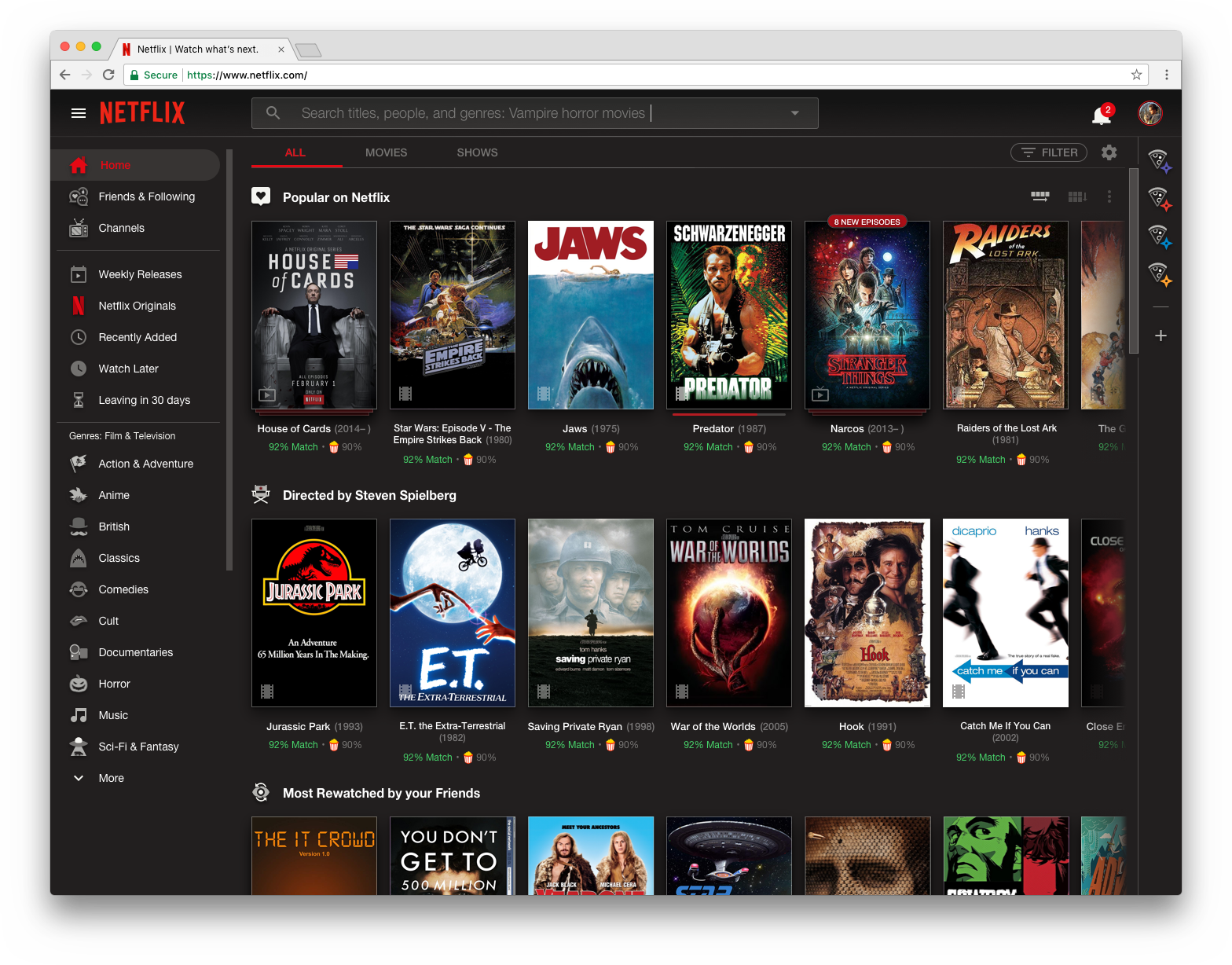
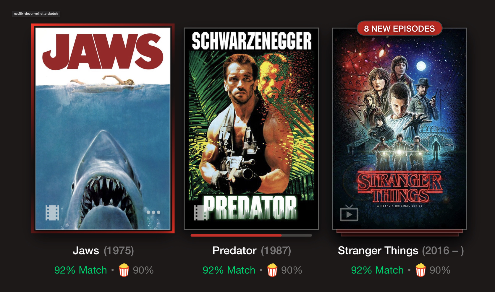
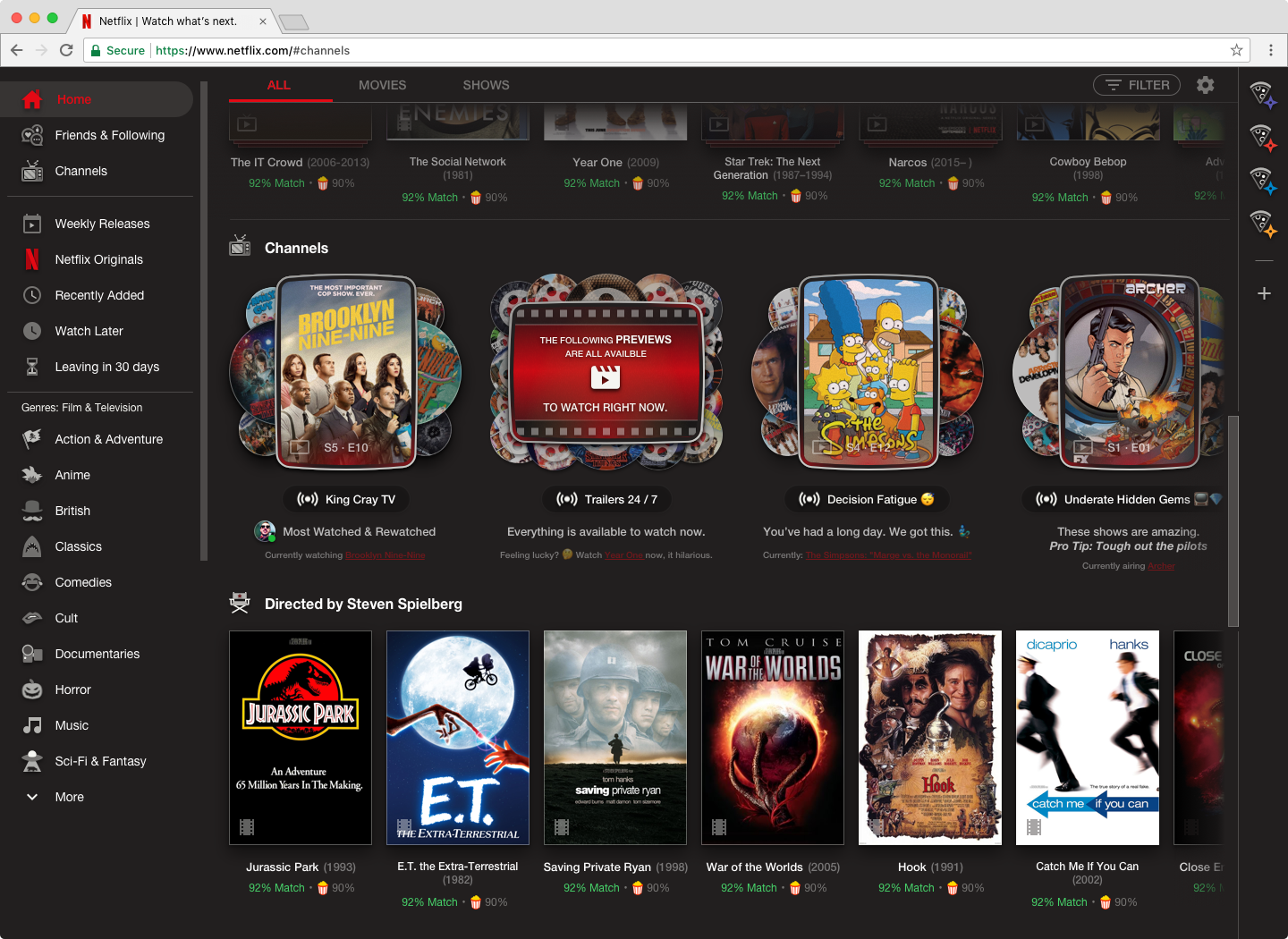
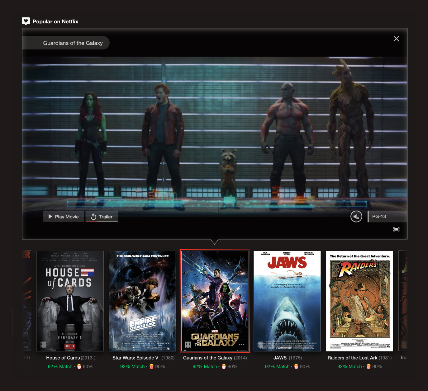
Introduced a “shelf view” inspired by the nostalgia of video stores, showcasing large, detailed movie posters that highlight the artistry of film marketing.
Created a toggleable “dynamic grid” for popular titles, offering users a fast-loading, scrollable view without sacrificing immersive visuals.
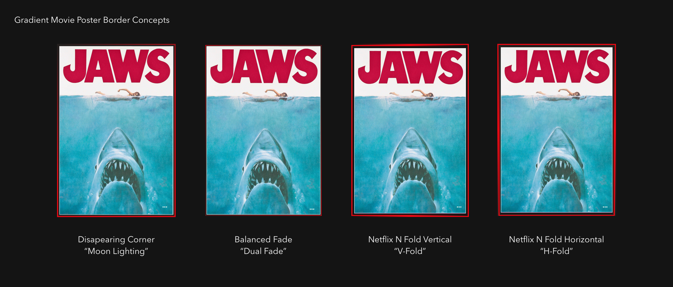
Netflix targets different film artworks to suit users' viewing habits, the same can be done with the proper movie posters.
2. Rich Content Details
IMDB-like Info
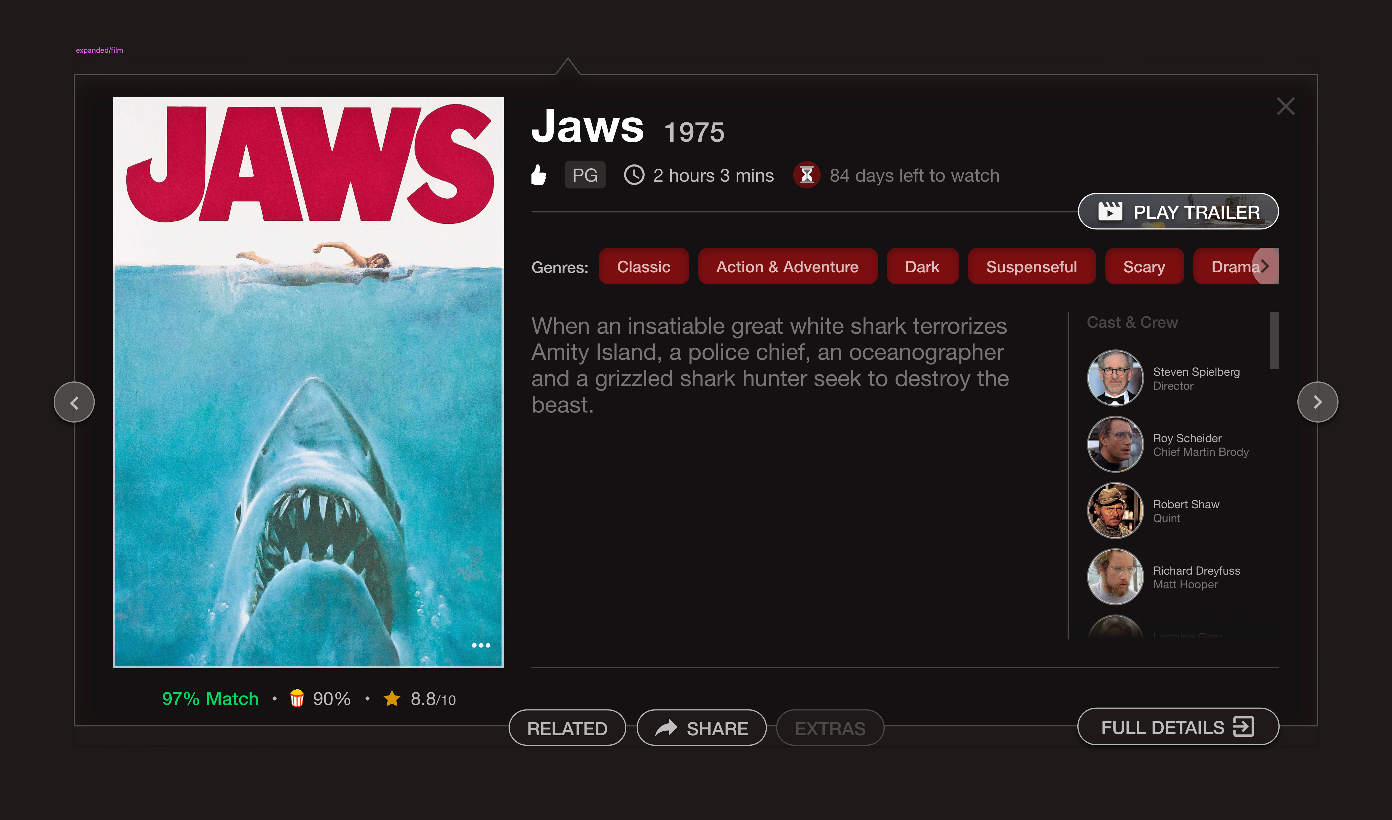
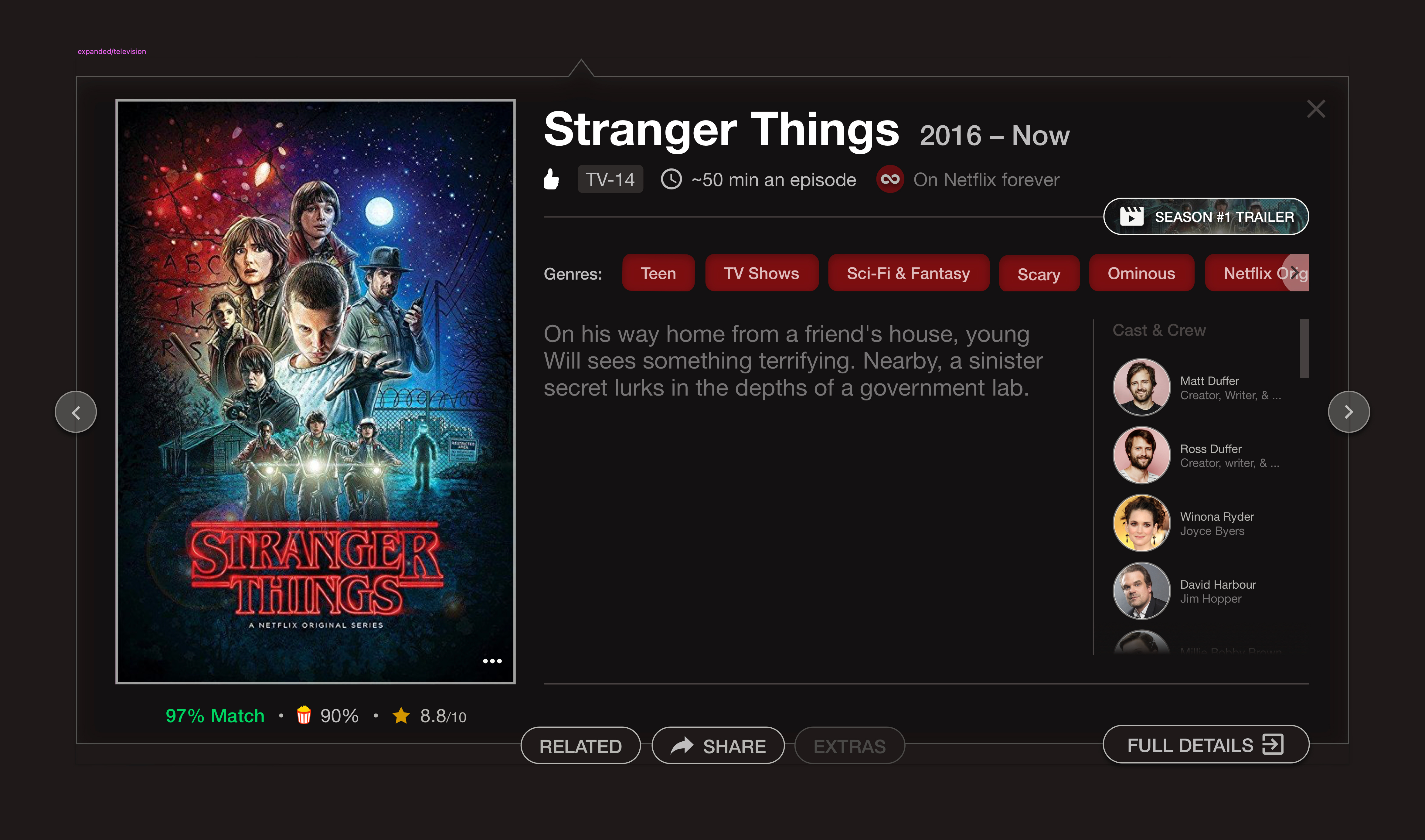
Designed an interactive credit system for films and TV shows, allowing users to explore above- and below-the-line crew (e.g., cinematographers, editors, costume designers) and discover related titles.
Incorporated IMDb, Rotten Tomatoes, and Netflix’s percentage match ratings directly into the interface to empower users with more robust decision-making tools.
3. Reviving DVD Bonus Features
Developed concepts for “Bonus Features” tabs, where users could access trailers, documentaries, deleted scenes, and commentary tracks—recreating the depth and nostalgia of DVDs.
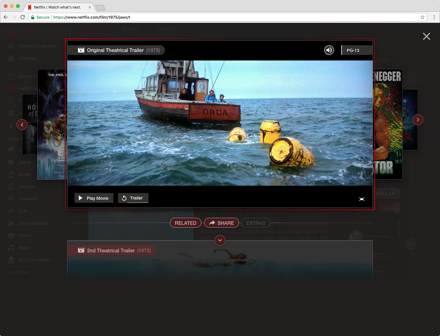
4. Channels for Passive Viewing
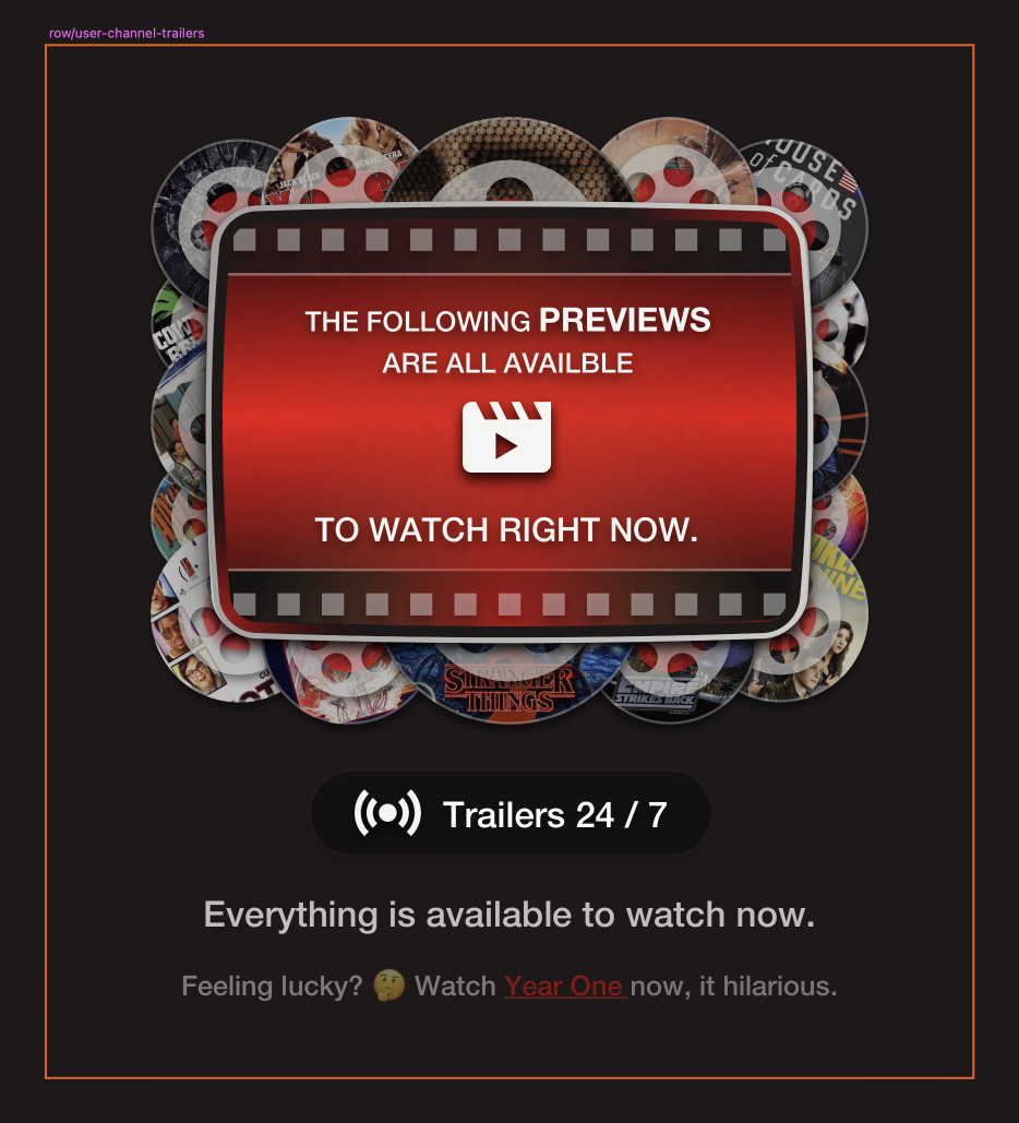
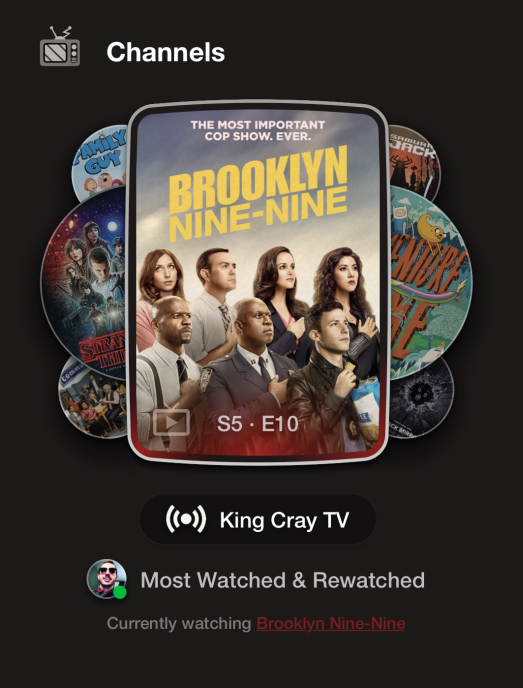
Conceptualized live, genre-based channels (e.g., Horror, Comedy, Classics) where users could tune into pre-curated content streams. This allowed viewers to “jump in” mid-stream, simulating the serendipity of channel-surfing on traditional TV.
Added a 24-hour looping trailer channel for quick discovery and watchlist additions.
5. Personalized, Social Discovery
Designed a “Most Rewatched by Friends” feature, leveraging social data to recommend shows or movies based on viewing trends among a user’s connections.
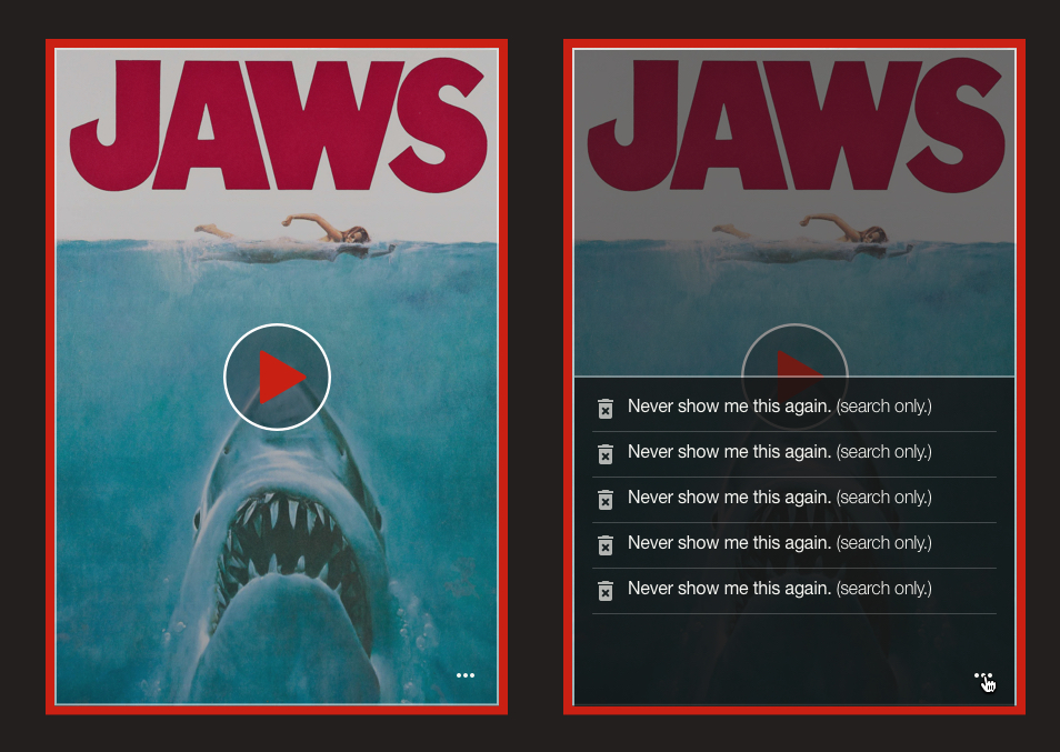
Incorporated granular personalization tools, including the ability to block certain content permanently from suggestions.
Process
Research & Discovery
Inspiration
Bringing back some of the magic and mystery of when my sister and I would go up and down the aisle looking for the perfect movie.
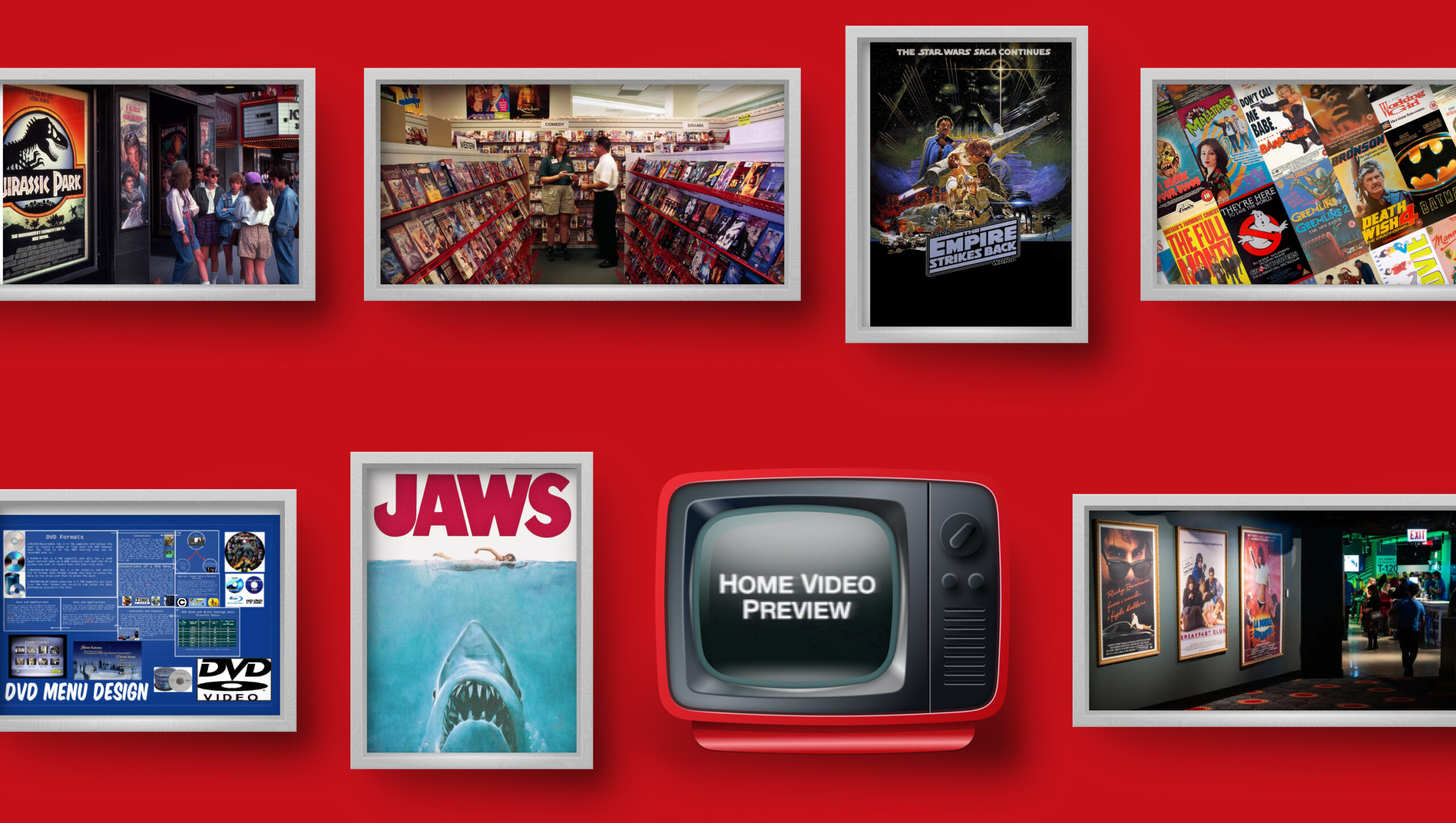
Audit & Analysis
Audited Netflix’s existing interface, identifying opportunities for visual and functional improvement.
Sublimate the Experience
Explored open-source databases and APIs for film information, imagining how this data could enrich Netflix’s library.
Design Iteration
Sketched initial concepts and user flows, iterating nightly after work to refine workflows and interface elements.

Focused on balancing nostalgia and modern design principles, blending the tactile charm of video stores with sleek, responsive layouts.
Prototyping & Validation
Created high-fidelity mockups to showcase the final design concepts, emphasizing discoverability, interactivity, and personalization.

Tested workflows informally with friends and peers to gauge usability and excitement around the proposed features.
Impact
While speculative, this project demonstrated several key outcomes:
Enhanced User Engagement
By integrating bonus features, interactive credits, and live channels, the design aimed to make Netflix a richer, more engaging platform for cinephiles and casual viewers alike.
Improved Content Discovery
Features like shelf view, trailer channels, and robust filtering tools addressed decision fatigue and simplified navigation, empowering users to find content that resonates with their tastes.
Showcasing Design Thinking
This project demonstrated my ability to think critically about user needs, balance nostalgia with innovation, and craft a cohesive experience that enhances both usability and delight.
Reflection
This project wasn’t just about creating a pretty interface—it was a deep dive into what makes the movie-watching experience memorable and satisfying. By working every night for a month, I challenged myself to reimagine Netflix as a platform that not only streams content but celebrates the artistry and culture of cinema. It was an exercise in blending passion with problem-solving, and it reinforced my belief in designing for emotion, nostalgia, and practicality. Even without official constraints or data, imagining what could be was an invaluable learning experience.
Case Studies
